Ardent Mills Design System
Ardent Mills is a leader in the flour milling industry, managing the complexity of its business with a suite of custom applications. The Ardent Mills Design System serves as the cornerstone that aligns designers and developers in their efforts to advance these essential tools. This project focused on expanding, improving and optimizing the design system to support the goal of bringing consistency and scalability to the company’s custom applications.
Client
Ardent Mills
Role
Designer
Background
A patchwork of applications
When Ardent Mills built its core business applications, they used different software development companies for each one. To complicate the matter, there was no design system in place to guide the development. The result? Poor UX practices and a noticeable lack of consistency across products, leading to a muddled experience for users and an unnecessary increase in the cost of design and development.
A turning point came when the company hired a designer, leading to the birth of their custom design system. What followed was an arduous journey to unify their core applications by aligning them to the new design system. Prism, the company’s operations platform, was the first to undergo a makeover. Vault, the company’s sales platform, was next in line. And that’s where this story begins.
Vault
Not using the Ardent Mills Design System
The Problem
Gaps in the design system
As efforts to align Vault to the design system kicked off, an unexpected problem emerged; our design system lacked elements that were essential for Vault’s functionality. These gaps were hindering our path forward and we needed to expand our design system capabilities.
The Goal
Expand, improve, optimize and document
This unexpected issue created a great opportunity to strengthen our design system all around. Not only did we aim to expand it by adding the necessary components, but we set out to improve the functionality of existing ones and refine rules and guidelines. We also planned to create new documentation and improve existing documentation to solidify understanding across cross-functional teams and bolster future success.
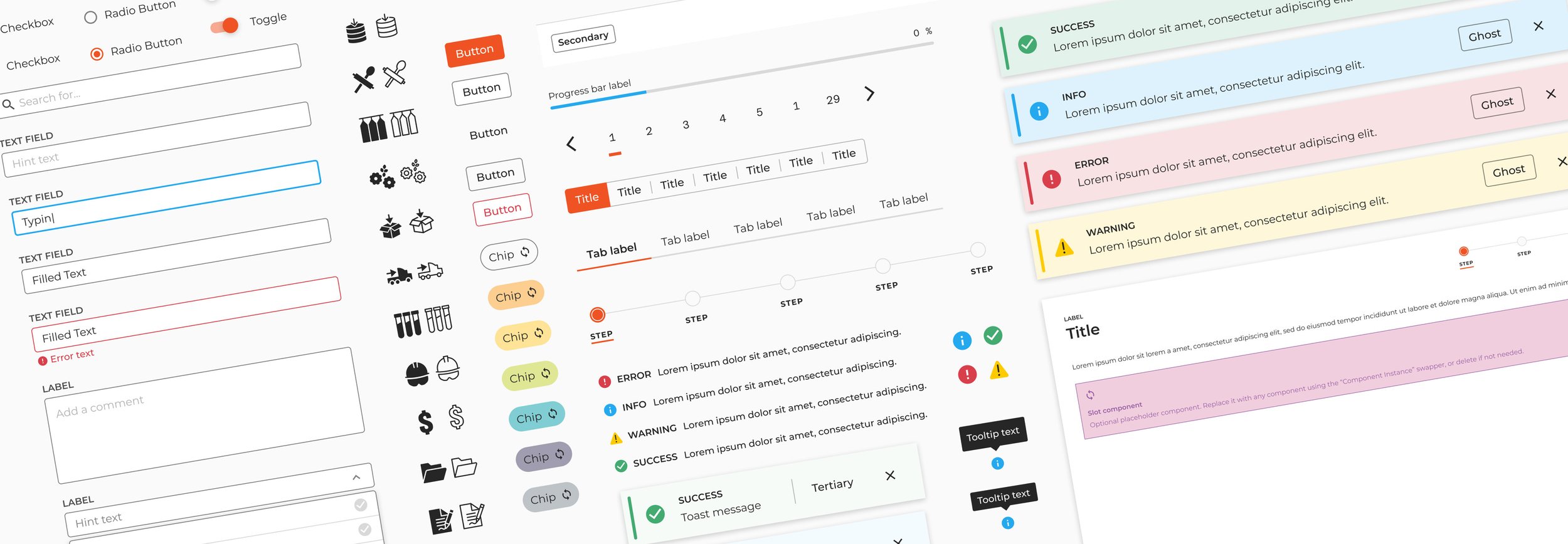
Component Library
Expansion
Our team of three designers collaborated to double our design system by 15 components, including accordions, modals, segmented controls, tabs, tooltips and more. This process began with thorough research of industry-leading design systems to gain insights. We also conducted a review our own applications to identify use cases and define the required functionality. Among my contributions were alerts screens, an essential addition to the numerous multi step processes in our custom applications.
Improvement
Usability & Accessibility
The existing components in our library were a couple years old by this point. We seized this opportunity to elevate their usability and adherence to accessibility standards. Small but significant adjustments were made to spacing and size to enhance readability. A focus state was introduced for those using assistive technology. We also added guidelines about verbiage, especially for labels and hint text on input components.
Atomic Design
The real game-changer was the incorporation of atomic design principles. We rebuilt components, joining modular elements into base components. This transformation streamlined our workflow, making updates to downstream variants and complex components quick and easy.
User-friendly Controls
It can be frustrating as a designer to have to dig into the layers of a component, especially when creating complex designs. Property controls were added to components so common things like visibility could be changed easily.
Optimization
In the spirit of pursing improved performance and consistency, we set up a quality standard for our components. Every component was reviewed against a checklist that standardized naming, component states and more. We meticulously tested each component, checking for errors and bugs, refining until we reached the finished product.
Documentation
Well-crafted documentation is crucial to effective collaboration by providing a source of clarity. Like a guiding light, it equips team members with the tools to make informed design decisions while minimizing the misuse of components and styles. A large part of this project was devoted to adding and improving documentation to provide a consistent and thorough knowledge base. At the end of this project, we added 12 new component pages, 5 new foundations pages and refreshed all existing pages.
Anatomy
Components often consist of multiple elements; many whose usage is not always obvious. To make their structure clear, we created visuals to illustrate their anatomy and define their use. These visuals are especially useful for displaying context-specific elements that are often hidden.
Usage
Usage guidelines help users navigate when and how they should use a component. We’ve noticed uncertainty in distinguishing the roles of similar components, like check boxes and radio boxes. We’ve also seen varying approaches to spacing, hint text, labels and other vital elements. To cut through this confusion, we improved our usage guidelines so users can confidently pick the right component and use it effectively.
Best practices
Best practices are a perfect opportunity to showcase practical examples, pointing out common scenarios and potential pitfalls in component use. We combed through our applications to uncover different contexts in which a component might be used. This approach prepares users for what they may encounter and gives us a better chance of achieving consistency.
Metrics
15
Components added to the design system
10
Existing components improved
18
Pages of documentation added
Promoting Awareness
Design and development thrive when users leverage the design system’s guidelines. Keeping everyone in the loop on updates to this important shared resource can be tricky. To solve this, we launched a newsletter, spotlighting the latest changes. The response has been overwhelmingly positive! Our efforts have increased engagement and even grown our community of users.
The Result
At the beginning, our custom applications felt fragmented and disconnected from each other. By expanding and maturing our design system, the goal of unifying the user experience across our custom platforms was finally a reality. Moreover, we laid a solid foundation for future success by bolstering our knowledge base and shared visual language for all team members.
Vault
Finally aligned with the Ardent Mills Design System!
Impact
Expanded design system capabilities
Improved knowledge base through documentation
Improved accessibility and usability
Created foundation for scalability with coded, reusable components
Challenges
Figma’s technical limitations
Designing components with functionality to meet most use cases
Lots of back and forth with developers to get visuals and functionality right
Lessons Learned
Pursue continuous improvement and maintenance of design-owned products
Propel awareness of the design system